Not how you launch an app... introducing Link HUB

Once again, I miscalculated the timing of an app launch: this morning Link HUB, a fun project I started a couple of weeks ago, debuted in the App Store after a very fast review process.
I had a few launch images and the product page ready, but not this introductory post, so I rushed out a tweet and the app debuted into the world 🎉, actually with a warmer welcome than most of my iOS apps in recent years had: according to App Store Connect, which is showing me data for the last 8 hours as I write this, over 50 people downloaded it already!
For an hobbyist, self taught developer like myself, that’s a big number. Certainly most of these downloads came from the very precious retweets from Becky, Brent, Chris and Simon, who I want to really thank for their help ❤️!
I also sent a grand total of 2 tweets and one email to promote the app to people I follow and that have an audience I believe might be interested in this kind of product. I am not sure if this massive marketing effort produced any effects yet, but somehow I doubt that…
And because haste makes waste, my rushed tweet actually bit me, because I promoted the app before its in-app purchase propagated in the App Store, something that actually pretty commonly requires a few hours after the app is approved (just like appearing in search results), but that I forgot about even if it already happened to me in the past. Do you see a pattern with my launch planning here?
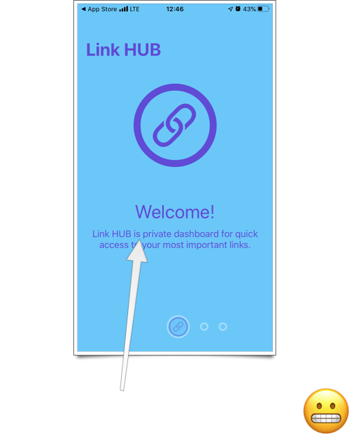
And from there, my day spiralled in a bit of a mess between my day job, errands to run while outside there were 38° C (100° F) but still wearing a mask (obviously, only a crazy and irresponsible person wouldn’t), replying to a couple of support emails and submitting version 1.1 of the app to add duplication of items (Link HUB’s first feature request… thank you Scott!), fix a small bug and correct something that was really, really painful for me to see… I can honestly say that the “best” moment of the day was when I realised that I had a typo literally in the first screen of the onboarding:

Now that my day has settled a bit (I’m home, in front of a fan running at its max speed, eating watermelon 🍉 with Milla 🐺 while Link HUB 1.1 is waiting for review, and the in-app purchase is finally appearing for Users around the world… I even have my first subscriber!), I thought I’d share today’s story as a warning to myself, and maybe other developers: as you probably figured out by yourself, this is NOT how you launch an app.
If you ask me, I’ll tell you that I know it’s not enough to put a lot of effort in Xcode. If you’re an indie, you know it too.
We all read great posts on what it takes to execute a good launch, and yet when the app is ready you just want to let it fly into the world, where sadly it will probably crash because you didn’t prepare the way for it as well as you could.
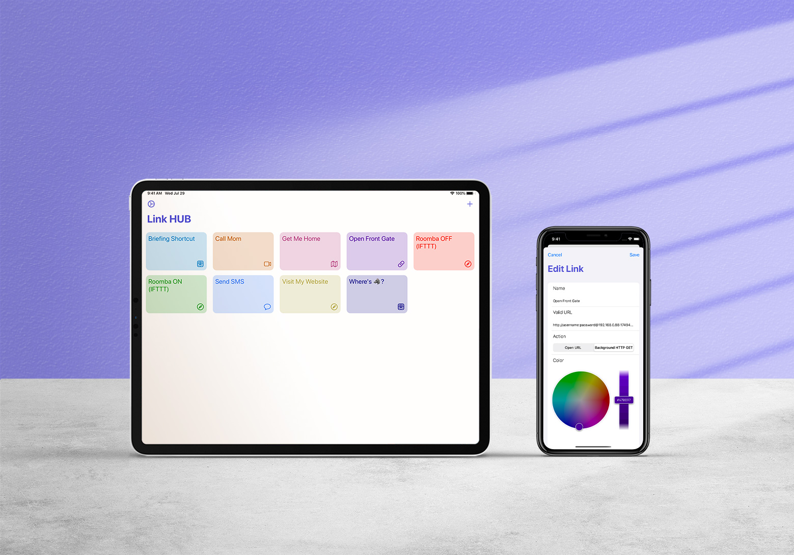
So, after this — hopefully at least a bit entertaining — cautionary tale, let me finally tell you about Link HUB, an app that clearly is here despite my best efforts!
Its product page describes Link HUB in detail, so I won’t repeat everything here, especially because the app is free to use (with limits: 4 links in the free version) so you can just try it for yourself… let me just say that, if you’re interested in a dashboard from which you can quickly launch any URL (and I mean any: websites, URL schemes, HTTP GET calls for automation, deep-linking into apps, IFTTT webhooks and so on), the app works nicely on iOS and iPadOS (where it’s a good multi-tasking citizen), syncs with iCloud, helps you get started with optional examples and manages to have a few nice touches (my first app with haptics and menus!).
For Users who want more than 4 buttons, an inexpensive subscription ($ 3.99 total for 1 year, I think it’s reasonable) is available as an option, and my hope is that the app can gain a niche big enough to make its future development sustainable, because I have ideas:
- NFC support (origin story: the app exists because yours truly and his brother in law wanted to play around with NFC tags… indeed, the Xcode project and repository are still called NFC because I am too lazy to rename them).
- A Mac version! I’m thinking “checkmark-Catalyst” (meaning, not too many differences from the iPadOS version, at least until I know there’s people interested), but I believe it could still be useful have it on all platforms even if it’s not the most native and chiseled Mac app ever.
- Reordering links (another feature request from Scott, thanks for this one too, I love feedback!).
- Search and maybe some sort of grouping? I don’t see folders in the immediate future, but if there’s demand I can look into that.
- When iOS 14 and iPadOS 14 ship, most likely a widget. I am familiar with the “old style”, Notification Center widgets, having built them for Tasktic, Walk More and Always There, and I actually loved the fact that they were true mini-apps, but it really doesn’t make sense to make one of those today, only to have it replaced by a less-functional one in a couple of months. But I won’t make promises on this front yet, because I still can’t read Swift UI (required for the new Springboard, non-interactive widgets): my brain breaks when I see its syntax.
Thank you for coming along in the first day of this journey.
I hope you’ll like Link HUB (App Store link here, so you don’t have to dig around in the post to find it) and that you’ll tell people about it.
As YouTubers say, please like (review in the App Store!) and subscribe (in the app, but also to my RSS feed.
And please, don’t hesitate getting in touch at support@cdf1982.com, I take great pride in replying to all emails I receive!